|
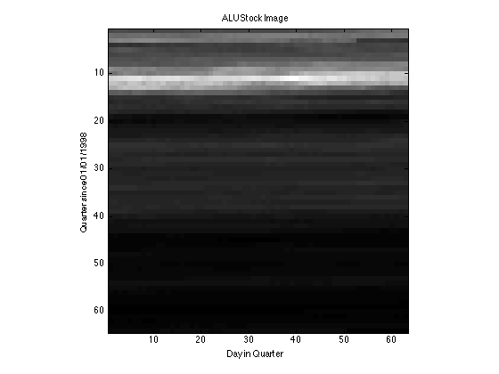
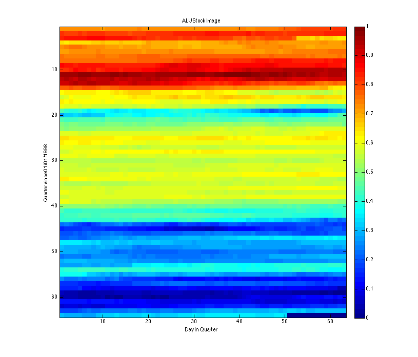
Can we learn anything when we turn the 1D history of a stock price into a 2D image? What do gain from the extra dimension? Is it profitable to jump from one quarter to another just by comparing pixels sitting on top of one another? I dunno, stop asking me. Will work on this later... [Laptop closes. Walk naked to get water. Return to bed. Laptop opens.] Ok, so sooner than later: I turned the image into a surface plot - obviously. Sometimes a different perspective can give new ideas and insights about other perspectives. If nothing, new perspectives are entertaining. To the surface plot! Comments are closed.
|
Archives
May 2014
Categories |


 RSS Feed